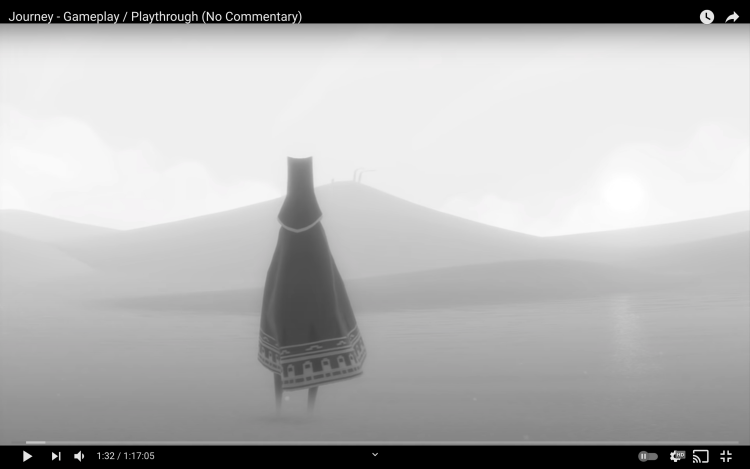
Journey (Thatgamecompany, 2012), according to game designer Jenova Chen, mimics the stages of life (2012). The variations in contrast of the character in relation to the world were designed to convey the stages’ emotions. Desaturated screenshots of the game will be analyzed. The beginning emulates childhood. The hero’s value starkly contrasts the tonally flat environment, creating “focus with value” (Tulleken, 2015). This directs the player’s attention onto the character and its abilities, alluding to the self-centredness of children. The environment’s low contrast expresses vastness and indistinguishableness, making the player feel free and at peace (Chen, 2012), yet also small and disoriented.

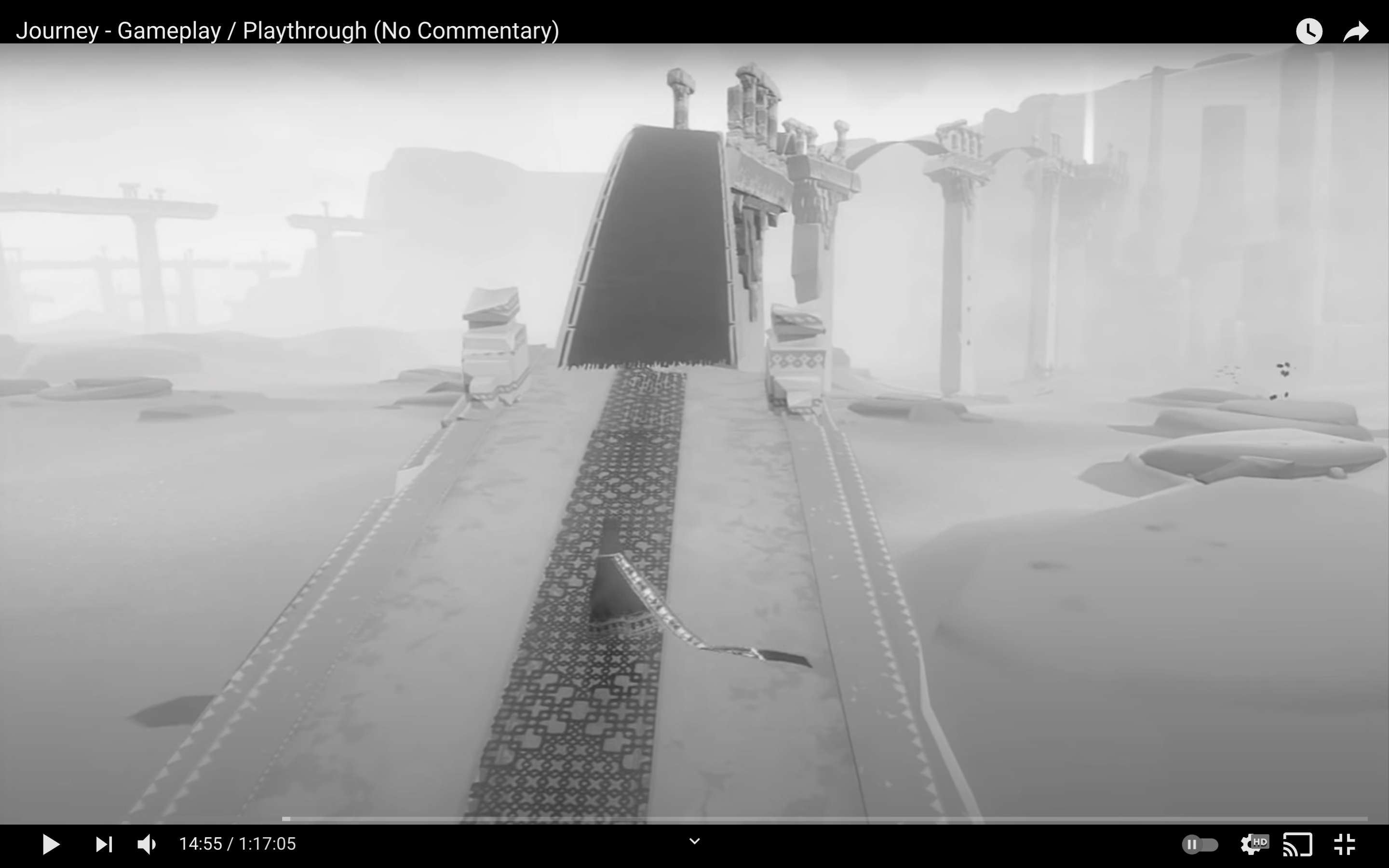
The stage of young adulthood’s design implies direction. Both the path and the player are distinct against the environment, spurring players’ initiatives to push forwards.
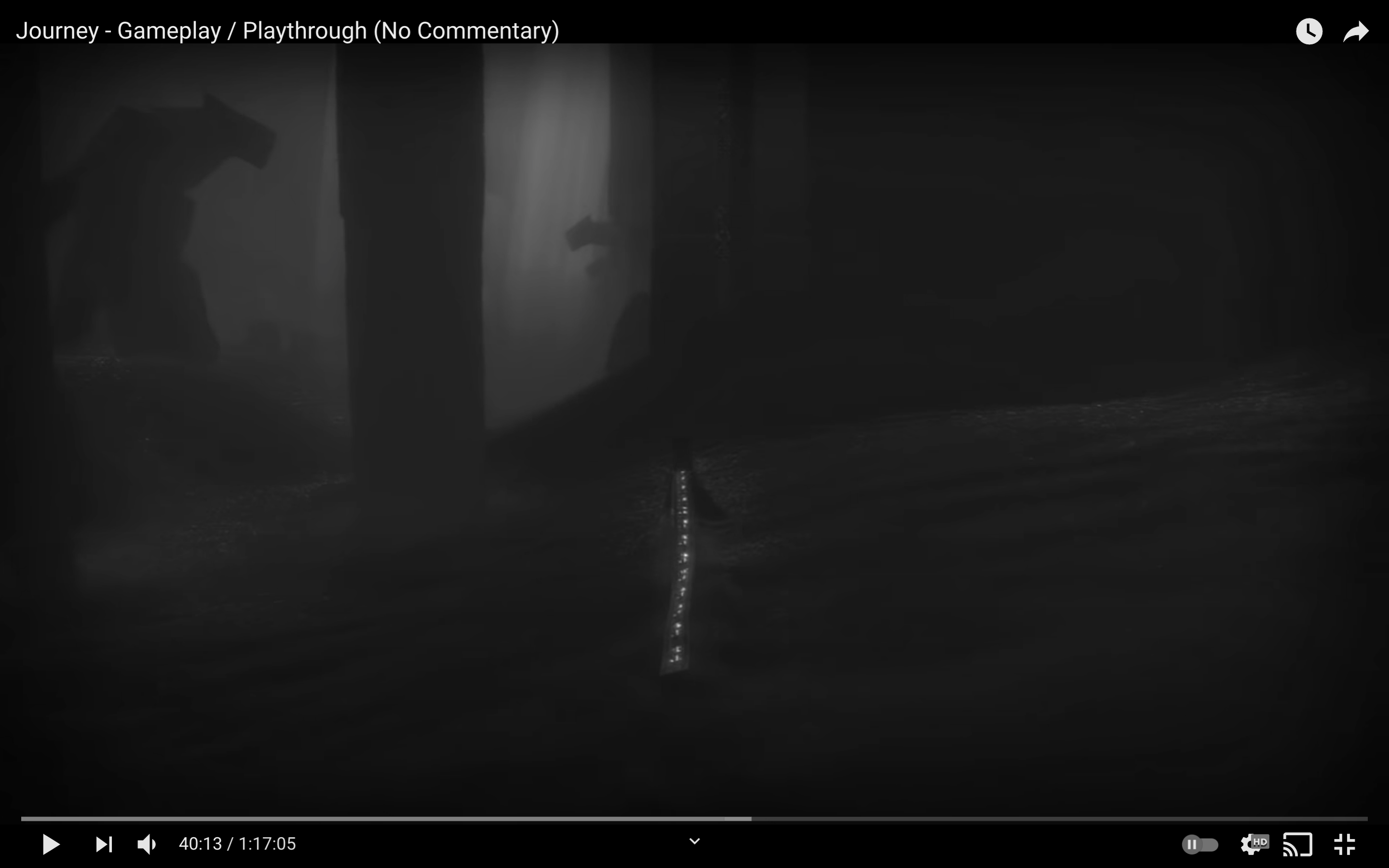
Adulthood is marked by difficulties: The designers composed a hardly navigable u n d e r g r o u n d : t h e p l a y e r i s b a r e l y distinguishable due to the somber, tonally sparse environment. The light source's luminosity is dimmed and blurred; there is no clear exit.

Eventually the hero walks toward “the responsibility and the trials of adulthood”, “rediscovering” and “focusing” (2012), as depicted through the returned high contrast. With the character’s luminosity much higher than that of the environment, this section inverts the game’s beginning, where the character was dark, implying that he is now conscious of himself and of the world around him. Yet, the trials continue, and the hero dies in a low-contrast setting, washed-out by the world. The low contrast obscures the path, causing the player to lose his spatial awareness and direction. The hero’s resurrection, which corresponds to transcendence after death or downfall in life, is portrayed through high- contrasting images. The player glows, the images look lively through a large array of grey tones until finally, the player is swallowed by brightness.
